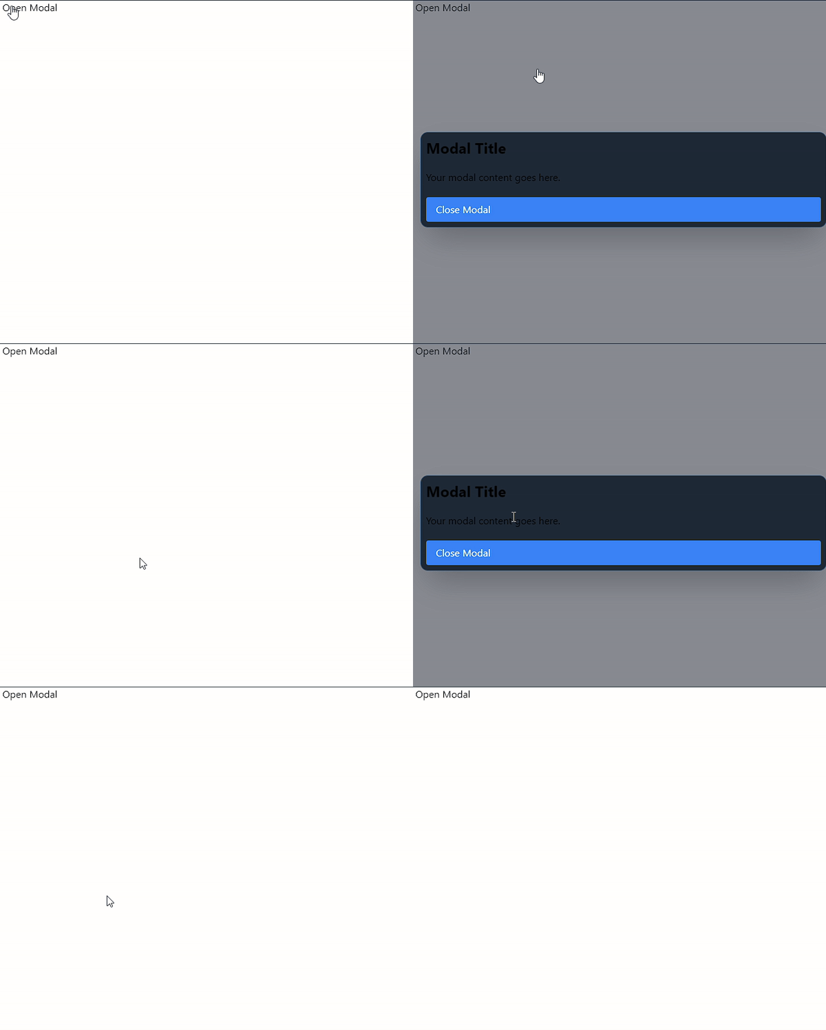
In the world of web development, modals are a common UI element used to display content in a layer above the page. While there are many libraries and frameworks that offer modal components, it's possible to create a simple, accessible modal using just HTML, CSS, and a dash of cleverness. In this blog post, we'll explore how to create a modal using only a checkbox and Tailwind CSS.
The Concept
The key to this technique is using a hidden checkbox input and the :checked pseudo-class to toggle the modal's visibility. By leveraging Tailwind's peer and peer-checked utilities, we can create a modal that appears and disappears without any JavaScript.
Step-by-Step Guide
1. Set up the checkbox and trigger
First, we'll create a hidden checkbox and a label that acts as the trigger for our modal:
<input type="checkbox" id="modal-toggle" class="peer hidden" />
<label for="modal-toggle" class="cursor-pointer select-none p-1">
  <!-- Your trigger icon or text here -->
</label>
2. Create the modal container
Next, we'll set up the modal container that will be shown when the checkbox is checked:
<div class="fixed inset-0 z-50 hidden bg-gray-900/50 p-3 peer-checked:flex items-center justify-center">
  <!-- Modal content goes here -->
</div>
3. Add a close trigger
To allow users to close the modal by clicking outside of it, we'll add another label:
<label for="modal-toggle" class="cursor-pointer absolute inset-0 -z-10"></label>4. Style the modal content
Now, let's add some styles to the modal content:
<div class="flex flex-col gap-5 w-full max-w-3xl h-auto bg-white dark:bg-gray-800 rounded-xl border border-blue-400/30 md:p-5 p-2 shadow-2xl">
  <!-- Your modal content here -->
</div>
5. Populate the modal
Finally, add your desired content to the modal. This could be a form, search results, or any other content you want to display.

The Complete Code
Here's a simplified version of the complete code:
<div>
  <input type="checkbox" id="modal-toggle" class="peer hidden" />
  <label for="modal-toggle" class="cursor-pointer select-none p-1">
    Open Modal
  </label>
  <div class="fixed inset-0 z-50 hidden bg-gray-900/50 p-3 peer-checked:flex items-center justify-center">
    <label for="modal-toggle" class="cursor-pointer absolute inset-0 -z-10"></label>
    <div class="flex flex-col gap-5 w-full max-w-3xl h-auto bg-white dark:bg-gray-800 rounded-xl border border-blue-400/30 md:p-5 p-2 shadow-2xl">
      <h2 class="text-2xl font-bold">Modal Title</h2>
      <p>Your modal content goes here.</p>
      <label for="modal-toggle" class="cursor-pointer bg-blue-500 text-white px-4 py-2 rounded">
        Close Modal
      </label>
    </div>
  </div>
</div>
Conclusion
By using a checkbox and Tailwind CSS, we've created a simple yet effective modal without relying on JavaScript. This technique is lightweight, accessible, and easy to implement. Remember to adjust the styles to match your design system and to ensure the modal content is semantically structured and accessible to all users.
While this method is great for simple use cases, more complex interactions or animations might require additional JavaScript. Always consider the specific needs of your project when choosing a modal implementation.
🤗Happy coding!